Solar Turbines

Establishing clarity for users in a Contact Us form

Duration

Role

Team

Methods

11 Weeks

UX Design Intern

Product Manager, Business Analyst, UI Designer

Experience Design, Information Architecture, User Research, AI Prototyping

Project Overview

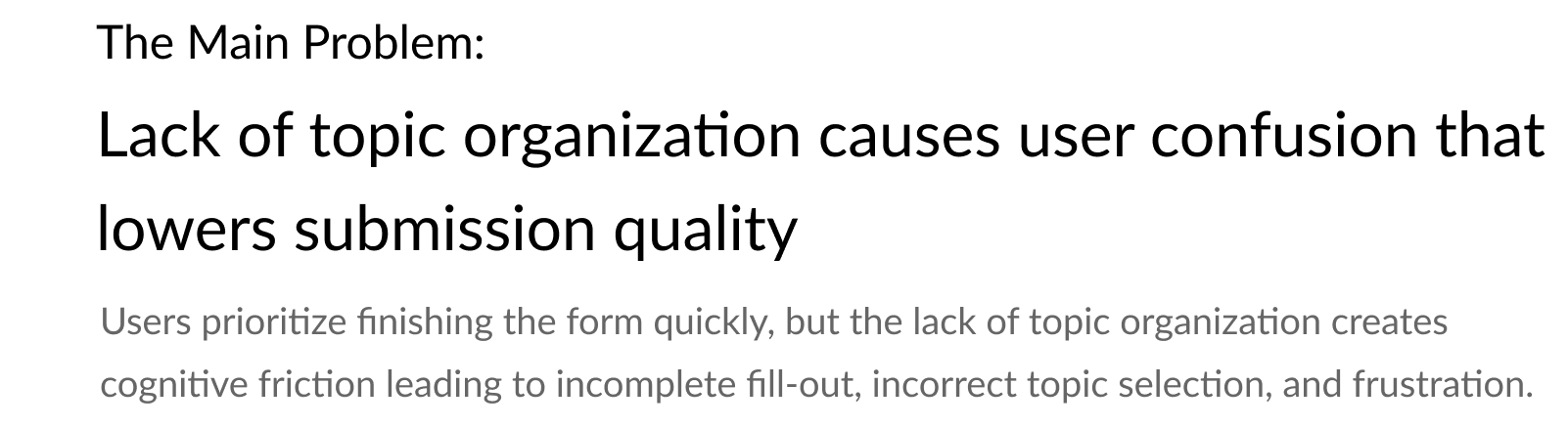
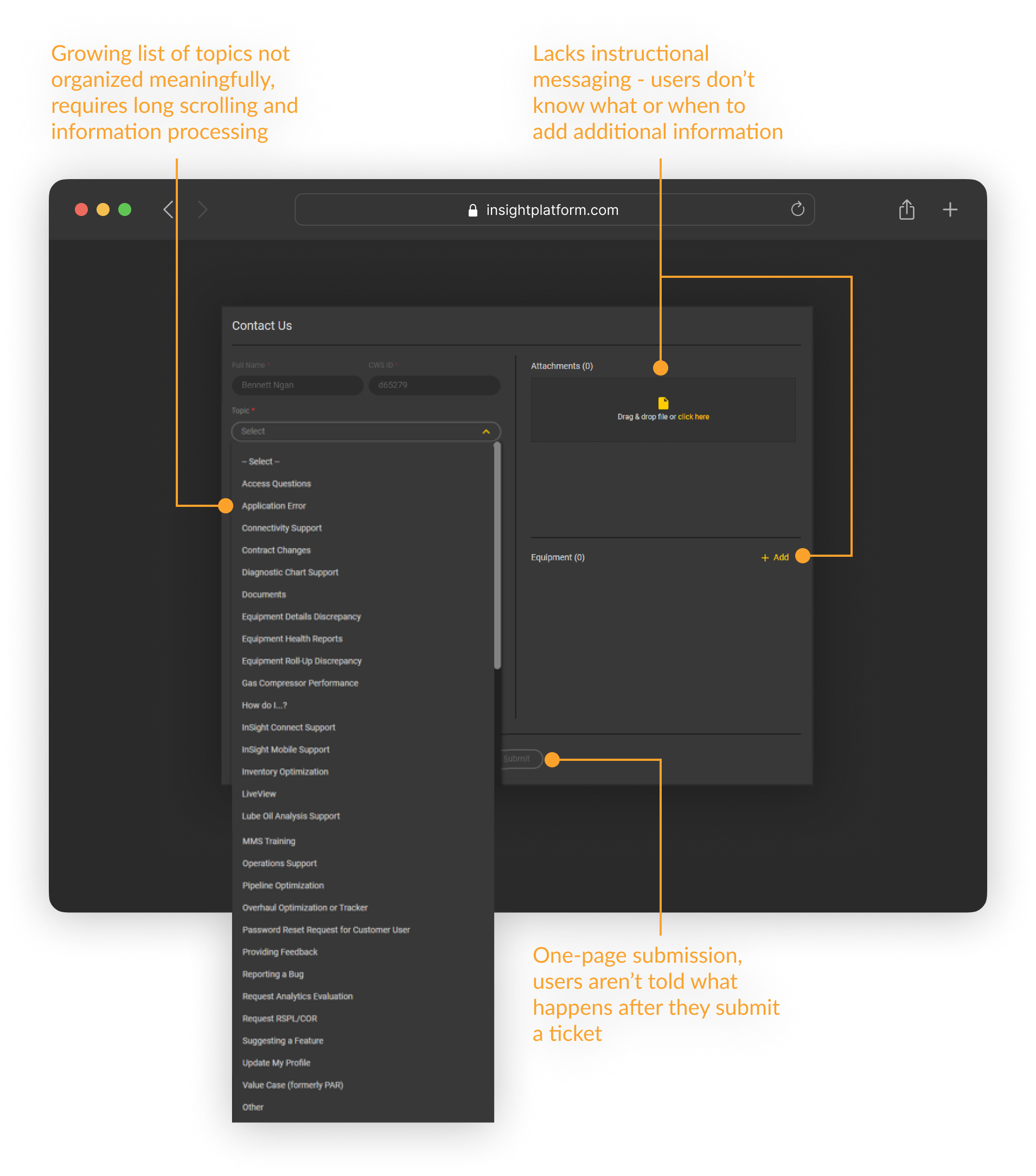
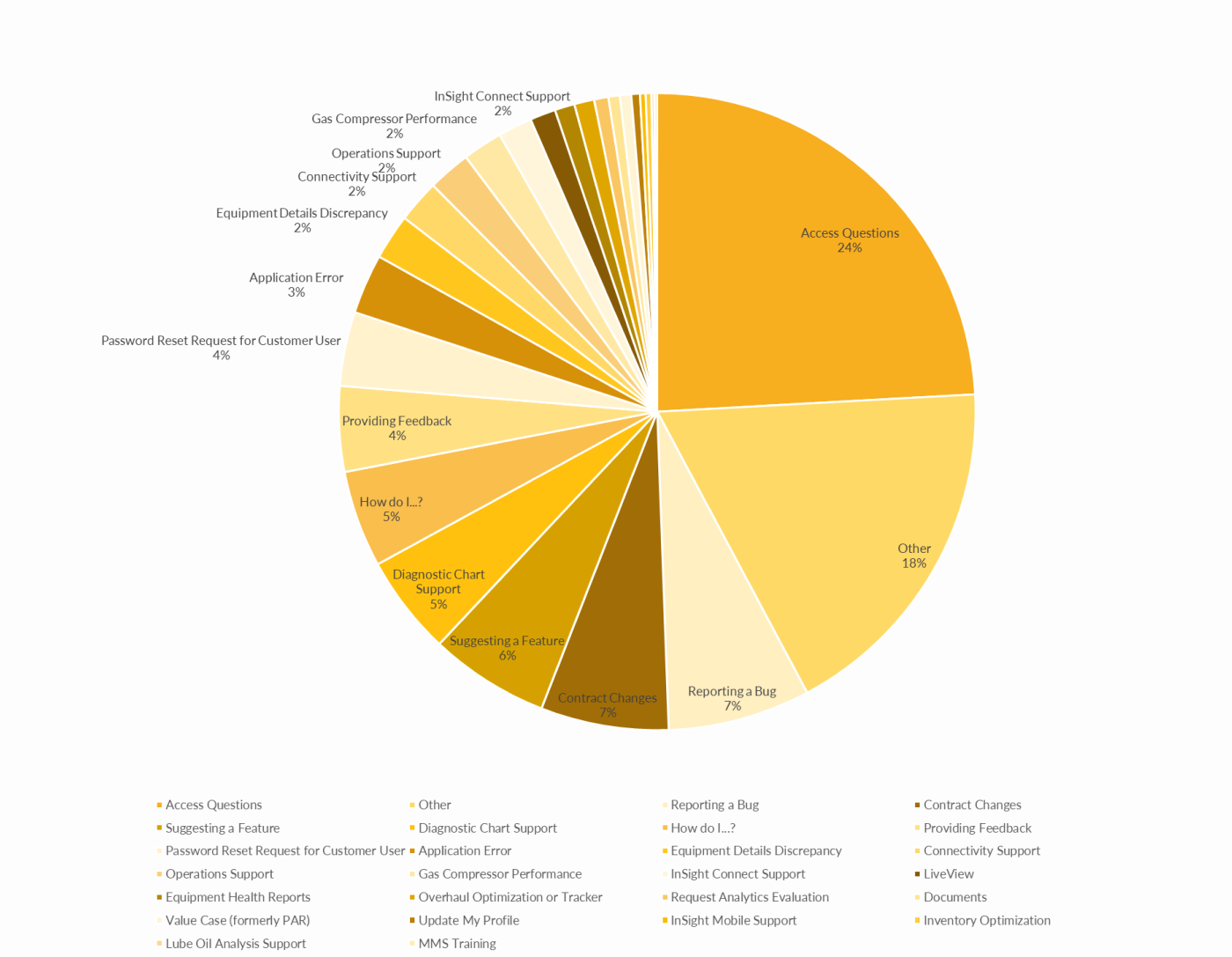
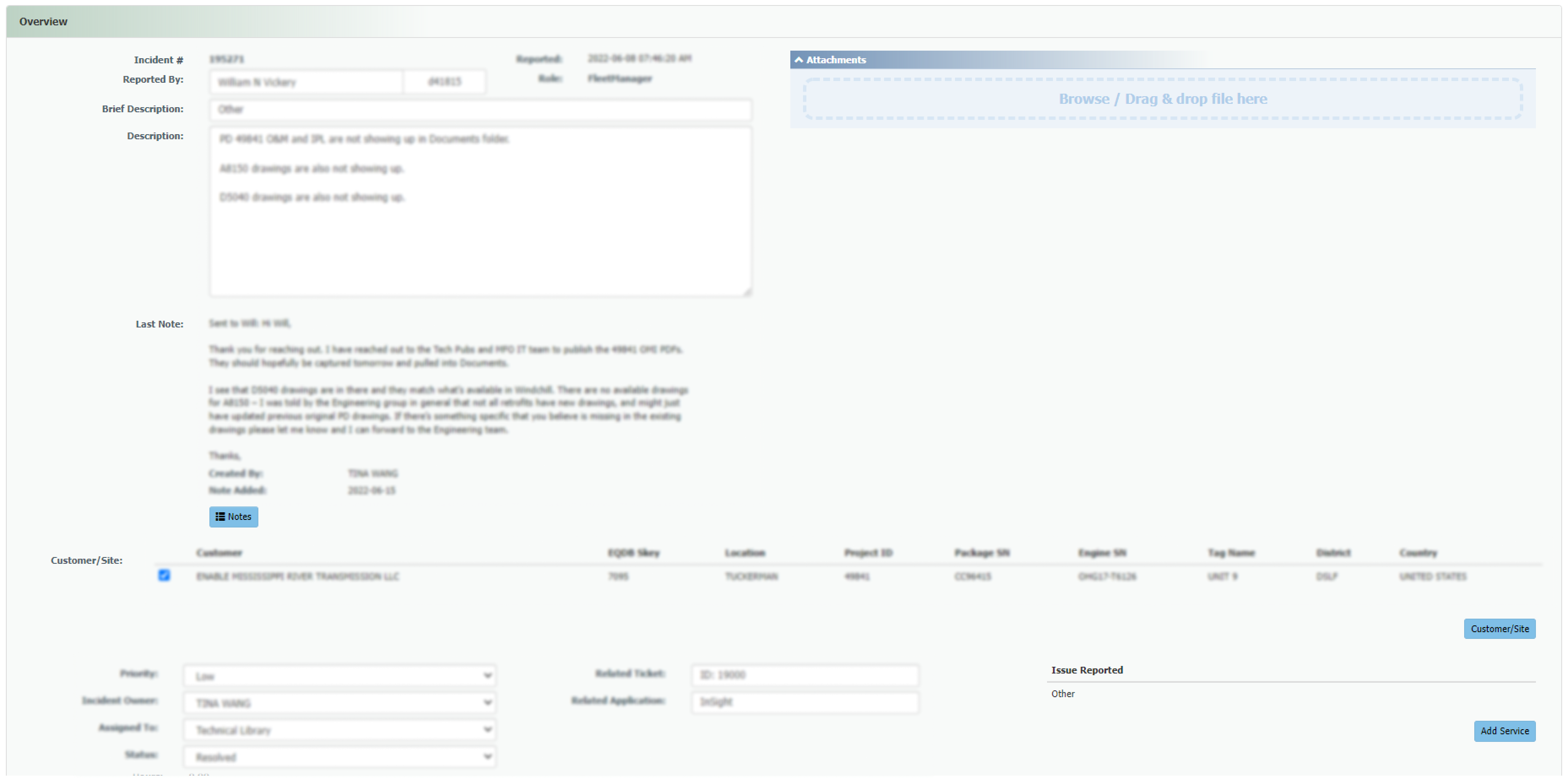
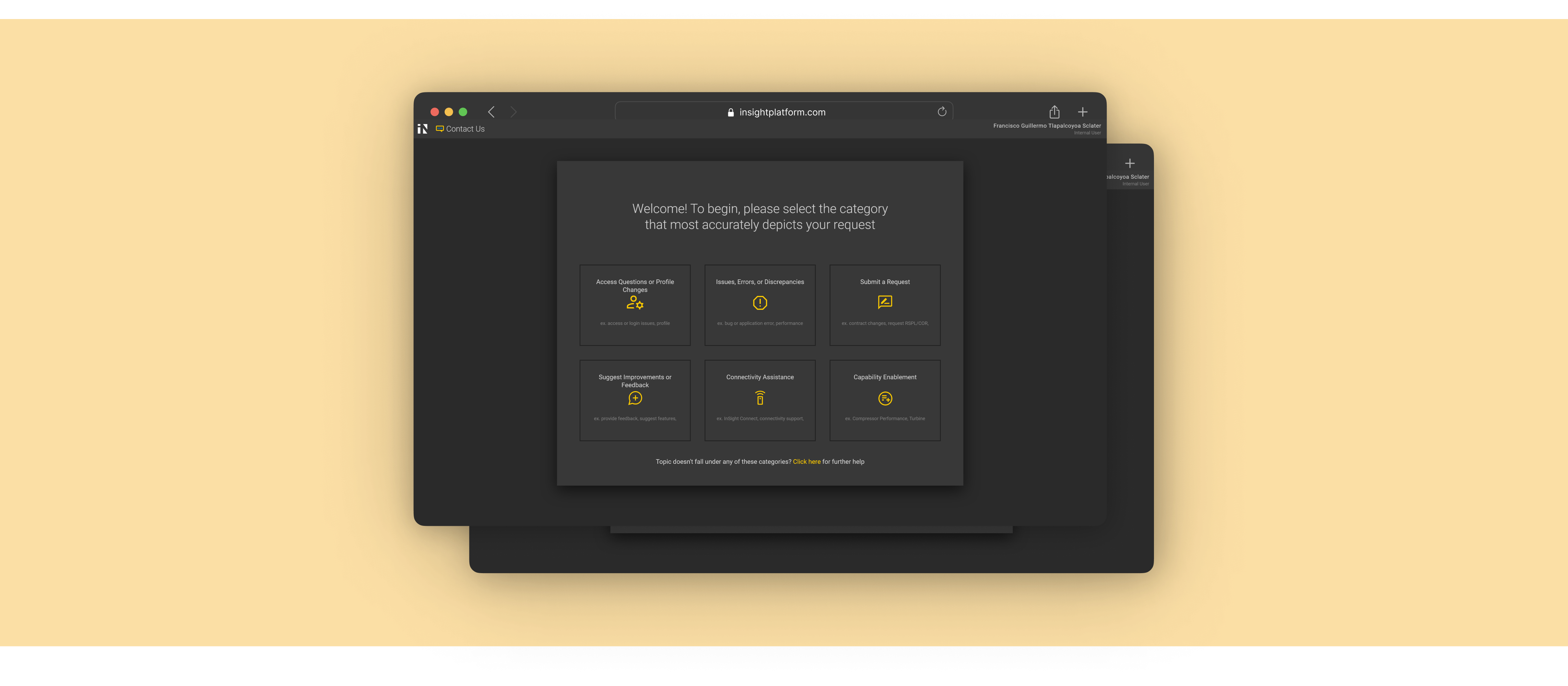
InSight is Solar Turbines’ SaaS platform for remote monitoring of industrial gas turbines. The Contact Us form has not evolved to reflect the software’s new features and developments over the years, resulting in low submission quality and slower ticket resolutions.

This increase in resolution time directly results in internal employees’ (Subject-Matter Experts, Product Managers, etc. ) reduction of bandwidth for other productive work, as well as potential revenue loss for customers facing critical issues leading to turbine downtime.

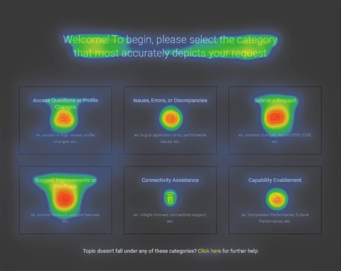
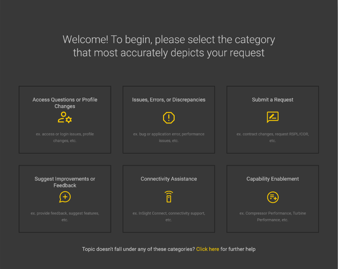
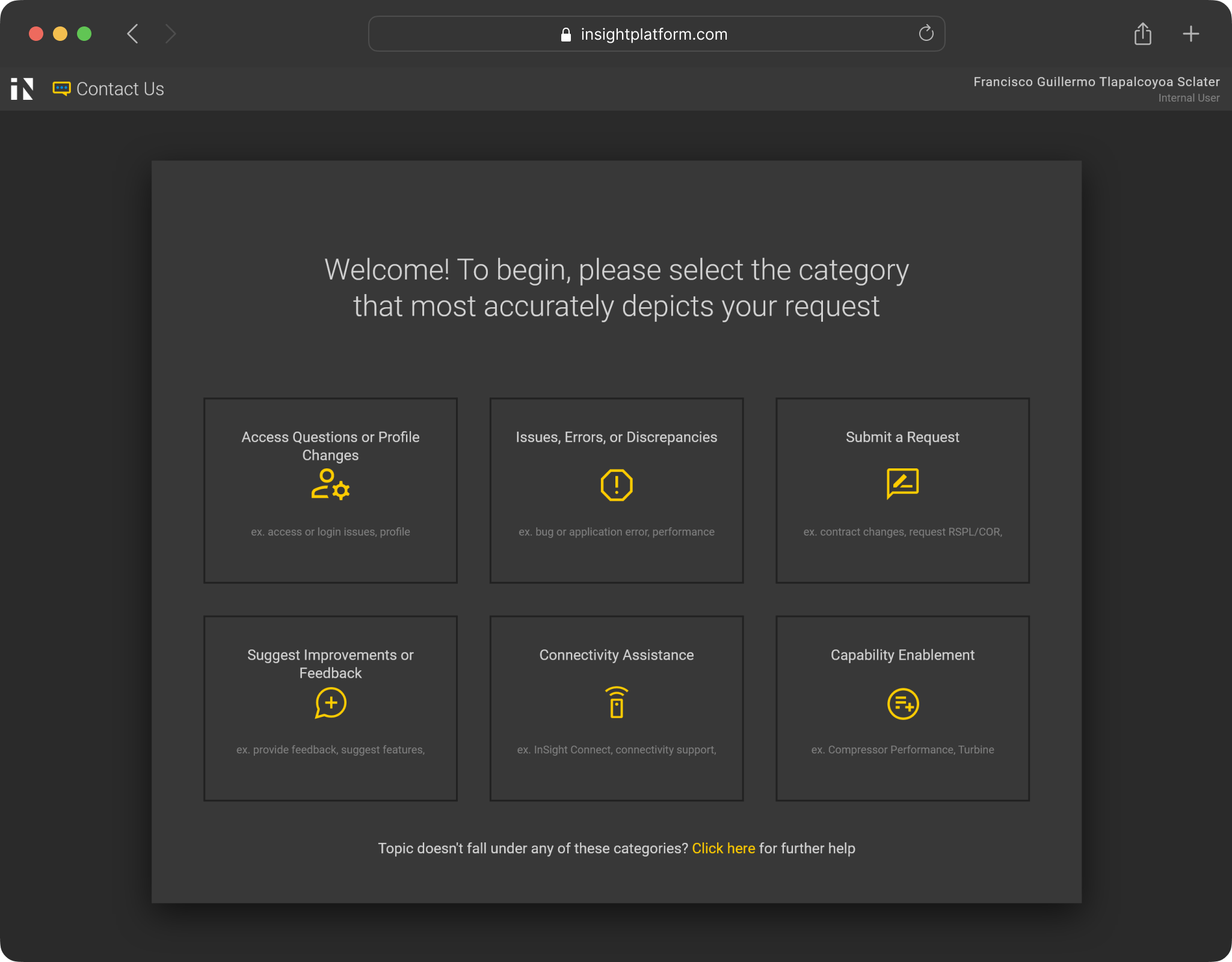
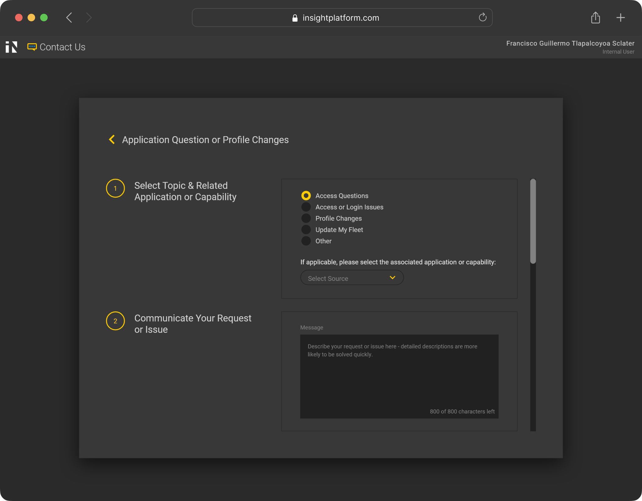
Consequently, I was tasked to redesign the contact us form, which was identified as a bottleneck within the help request system.
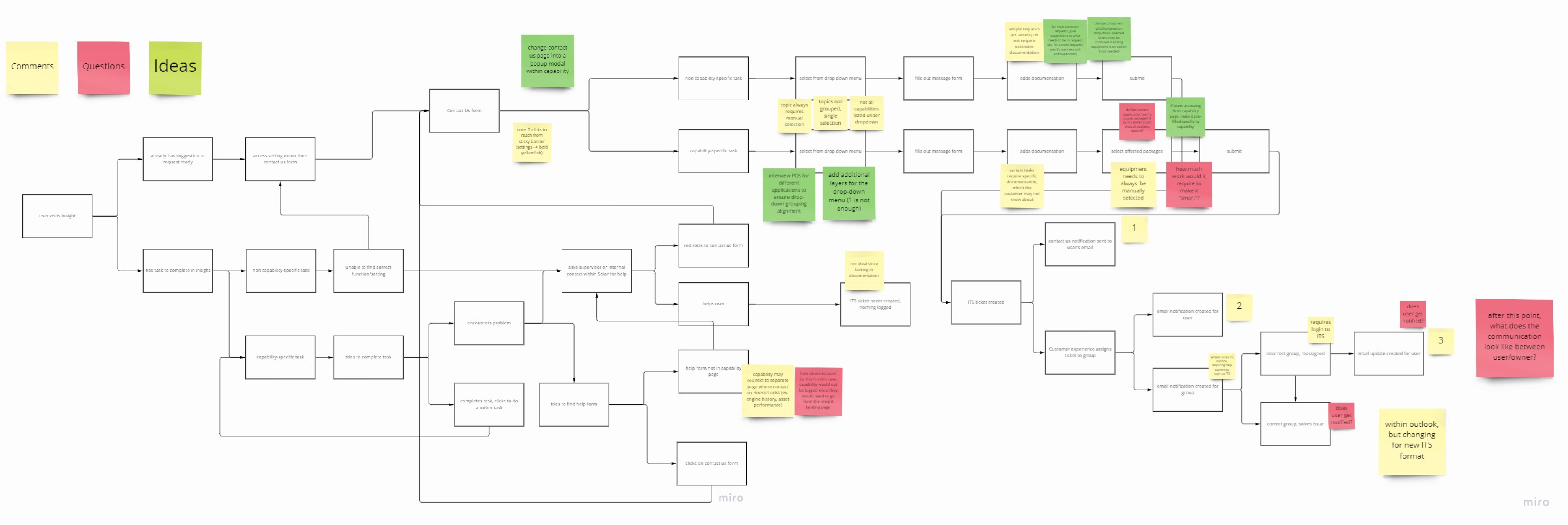
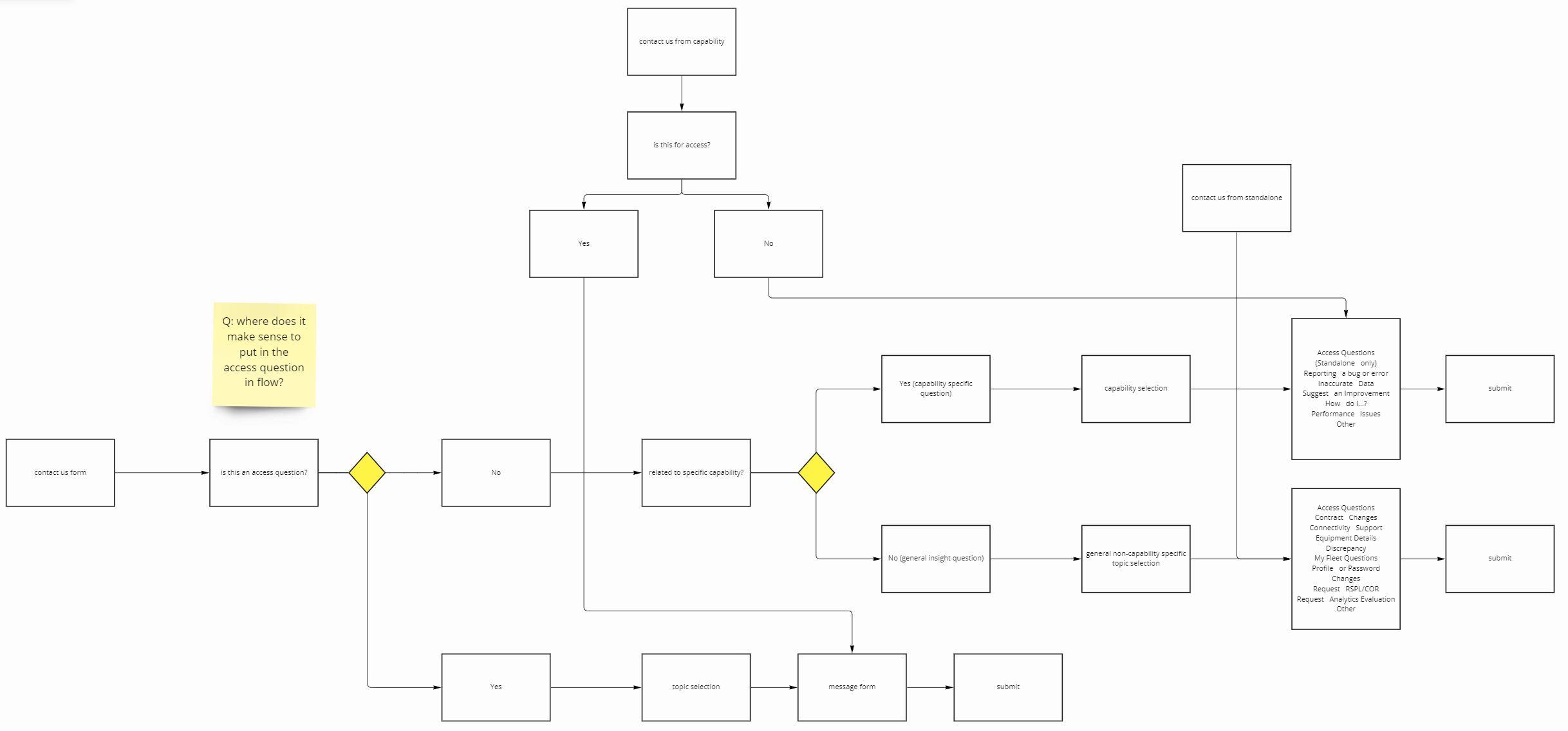
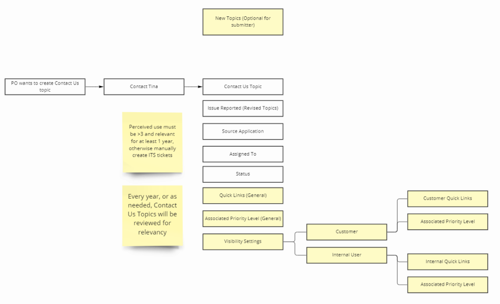
User Flows

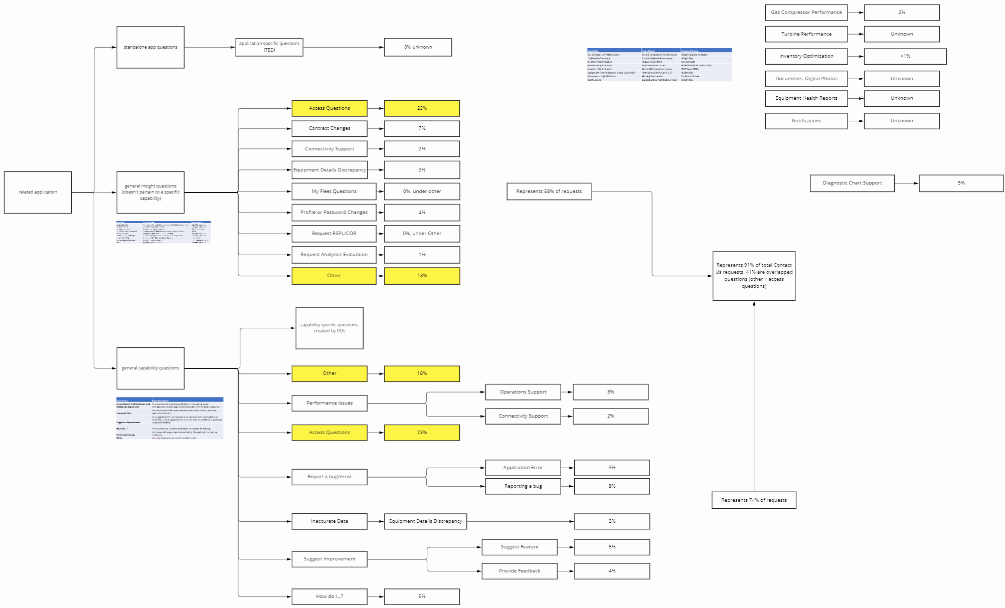
From interviewing several stakeholders and mapping out a comprehensive user flow, I realized that the Contact Us form served as the critical entry point for the entire help process - if not done well or thoroughly, the rest of the process is deeply affected. 

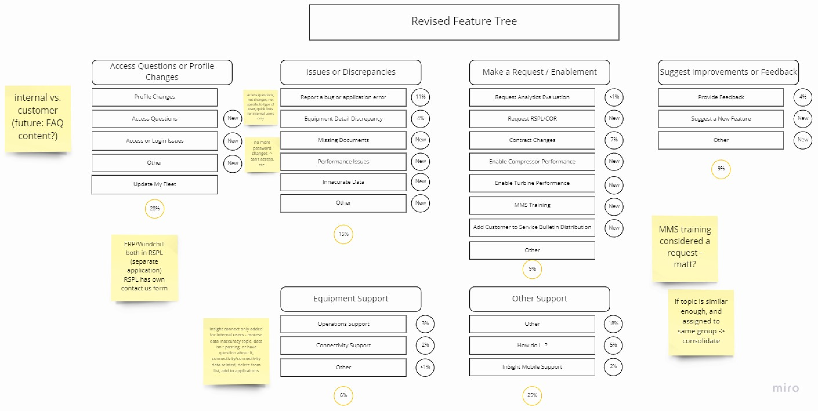
Another insight for the redesign was to prioritize flexibility and adaptability for future iterations, since topics and features were constantly evolving over time and would greatly benefit from a consistent structure.

The Existing Design

Goals

I proceeded by formulating an overarching goal: combine informational & visual hierarchy to reduce topical confusion and encourage form completeness. I also created some subgoals:

Reorganize help topics for intuitive selection

Change copywriting to include user-centric language

Explore using AI tools for UI design

Create IA framework that simplifies future topic iterations

These improvements aim to make the form more efficient and effective, saving valuable time for employees and customers. In addition, timely resolution of critical help tickets (turbine downtime) could potentially save customers thousands of dollars.

Category Breakdown

By breaking down each problem topic by submission percentage, I gained a high-level overview of the most popular topics and those that required the most revision. The “Other” problem topic was noted as an area for further exploration, as it either implied that there were missing topics or that there was user confusion in selecting the correct topic.

Reviewing individual tickets revealed nuances behind each problem topic - the majority of submissions were often issues that required specialized assistance, meaning that a general FAQ section would not work, and that shortcuts only make sense for a handful of problem topics due to their specificity.

Regrouping Process

Drawing similarities and patterns between problem topics, I gradually sorted them into distinct buckets. Eventually, an additional layer of categorical topic selection was created - general enough to encompass topics added in the future, yet specific enough to consolidate existing topics into meaningful groups.

Visual Design

I experimented with a visual AI tool to aid in rapid prototyping, aiming to create visual hierarchy that draws the user toward topic categories first, welcome message second, and descriptions last.

To discourage users from selecting “other” as the default category, I minimized its visual dominance while leaving it selectable as an option on the first page.

User Testing

Under the guidance of the lead UX designer, I planned and led hybrid user testing during the last week of my internship. This was a rare opportunity since Fleet Managers (primary users) were stationed across the country and only traveled to headquarters for occasional live training. Below are some key insights:

Simple Wording - Users are more likely to select an unrelated topic that includes the exact word they are facing an issue with, rather than to interpret phrasing to determine correct category. Wording should be carefully selected to keep this in mind for distinct separation between topics.

User types within user types - Users have different approaches to solving problems dependent on their experience and work style, which might not include requesting for help through an official form. Because users have different purposes for filling out the form, the core experience and functionality should be focused on.

Quick improvement - Users blew through the latter scenarios as they got the hang of how the new form worked. Onboarding training would be highly useful in minimizing confusion when the new form is introduced.

Next Steps

A key realization was that a comprehensive solution for the help request process expanded beyond the form itself, requiring improvements to the user experience before and after filling out the form. I documented revised processes for creating new problem topics, recommendations for application accessibility, and ideas for the ticket follow-up process.

Taking developmental and organizational processes into account, I separated my change proposal into two categories: improvements requiring lower effort that could be implemented quickly, and changes with larger impact that would require further development and buy-in from multiple teams.

Reflections

It’s all in the discovery - Don’t jump straight to conclusions - your most valuable skill is to accurately and thoroughly diagnose the issue plaguing your users/stakeholders. 80% of my internship was spent learning the nuances within complex business processes, and 20% actually creating my final design.

Take initiative - During my first week, I scheduled multiple 1-1s with people outside of the design bubble, along with 5+ design members. This was instrumental in knowing who to reach out when I needed help and learning best practices working in Solar.

Adapt quickly - Learn how to thrive in non-ideal scenarios - Final stakeholder presentations occurred before user testing due to shifting timelines, which allowed me to augment the testing plan to include business objectives.

Use multiple pieces of evidence - Mix quantitative and qualitative analysis to make your design more convincing. The AI tool I used was positively received by designers and stakeholders, and stemmed from my curiosity in learning and using new tools.